ECF Launches New Look & Brand Promise
March 28, 2024
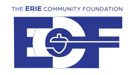
The 89-year-old Erie Community Foundation launched a new brand identity today. The updated logos and iconic acorn symbol serve as a graphic identity that will unite regional foundations and affinity funds across a modern look and dynamic color palette.
“This new look is rooted in a rich legacy of giving and lasting commitment to the future needs of a diverse community,” said Karen Bilowith, president and CEO of The Erie Community Foundation. “We are excited to introduce a modern take on our iconic acorn symbol, which serves as a visual reminder of the connection between our hundreds of charitable endowments established under the umbrella of the Erie Community Foundation, and the community we serve.”
Bilowith also announced that the 14th Annual Erie Gives is scheduled for Tuesday, August 13, 2024. As Erie Gives draws near, the Foundation will make exciting announcements about the plans for a successful, community-spirited event.
“Each year, Erie Gives unites hundreds of nonprofits, regional Community Foundations in Corry, Union City, North East and Findley Lake, as well as our affinity funds – this new Erie Gives logo brings us all together in a look that reflects the region’s enthusiasm for the always historic day of giving. Mark your calendars for August 13 and stay tuned!”
The Erie Community Foundation’s new brand promise: The Erie Community Foundation is a trustworthy and permanent steward of greater Erie’s generosity. Through the power of collective giving, we invest in solutions that transform lives.
The Erie Community Foundation’s new wordmark: The overarching design captures the strength of The Erie Community Foundation in a fresh and modern way, using all capital letters in a bold combination with a modern font, weight, and size paired with a bold color blocked background. Legibility and accessibility were taken into careful consideration to ensure all audiences will immediately recognize the brand.
The Erie Community Foundation’s new monogram: The design shows momentum and forward motion using a line, which extends from the acorn nestled within the C (representing community) connecting the E (Erie) and F (Foundation). The reimagined acorn pays homage to the symbolic mark from the old logo (and the installation located at the foundation’s office), helping to convey how the Foundation remains committed to the legacy of the work we have done while working to meet the future needs of a diverse community.
The Erie Community Foundation’s new symbol: The reimagined acorn is featured in the monogram logo and will also serve as a stand-alone symbol - a clean, bold, modern representation of The Erie Community Foundation and its integral role. With closer interpretation, the base of the acorn may be seen as an open palm to signify the many individuals served by The Erie Community Foundation. Logos for each affiliate and affinity fund, which mirror the central concepts of The Erie Community Foundation, have also been created. These logos are differentiated by a color palette representing each foundation and fund. The royal blue used for The Erie Community Foundation logos is tied into each affiliate monogram and symbol solidifying the connection and shared mission across all.
New Erie Gives logo: A new Erie Gives logo was created in preparation for Erie Gives, which will take place on August 13, 2024. The Erie Gives logo includes the brand colors for each affiliate and affinity fund.